The same badge, in every version she'll need
The round badge stays exactly as it is. We've cut the monogram and the lettering out of the same artwork so they can sit side by side where a circle is too tall, like a website header or an email signature, and made one-colour versions for print.

The badgeHer logo as it is today. Profile pictures, the magazine ad, anywhere there's room for a circle.

Side by sideMonogram and lettering from the badge, laid out wide. Website header, letterhead, email signature.

ReversedThe same lockup for charcoal backgrounds and dark photos.

One colourWhite or charcoal only. Single-colour print, embossing, a stamp.

Monogram onlyThe CS on its own for the browser tab, app icons and tiny spaces.
In a circleThe badge is already round, so it drops straight into Facebook, Instagram, Google and LinkedIn.

Lettering onlyCRUZE with FINANCIAL SOLUTIONS underneath, for narrow spaces.
Ground rules
Give it room
Clear space around the logo at least the height of the CRUZE lettering. Nothing else inside the dashed line.
40 mm · 160 px8 mm · 30 pxSmallest sizes
Side by side no smaller than 40 mm wide in print or 160 pixels on screen. Below that, use the monogram.
StretchedRecolouredEffectsBusy photoLeave it alone
No stretching, recolouring, drop shadows or outlines, and never straight onto a busy photo. Give it a plain panel.
Before anything new is printed. The badge we have is a web file, about 1500 pixels wide. It's sharp enough for the A5 ad and all of this, but a large sign or a banner needs the original artwork from whoever designed it, as an .ai, .eps, .svg or .pdf. Worth asking Sarah now.
Charcoal and gold from the badge, on ivory
Charcoal and gold are taken straight from her logo. Ivory replaces plain white so pages feel warm and expensive rather than clinical. The gold is used generously, but small text in gold uses the deeper shade so it stays readable.
Charcoal
#252422RGB 37 36 34 · near PMS Black 7 CThe badge background. Headings, body text, the dark panels.Cruze Gold
#AA8C30RGB 170 140 48 · near PMS 7753 CThe ring and monogram. Buttons, rules, the italic word in a headline.Deep Gold
#8A6F22RGB 138 111 34 · near PMS 7558 CSmall gold text, labels and links on ivory. Passes the readability test the lighter gold doesn't.Champagne
#D9BE78RGB 217 190 120 · near PMS 7502 CGold for dark backgrounds: text and highlights on charcoal.Ivory
#FBF8F2RGB 251 248 242 · uncoated paper in printPage backgrounds. Sand #F1EBDD is the same colour one step darker, for alternating sections.Stone
#6B6355RGB 107 99 85 · near PMS 405 CSecondary text, captions, the quiet details.The four soft tints tell her services apart on the website and in social posts. They're backgrounds and small accents only; headings and buttons stay charcoal and gold. Pantone matches are the nearest standard colours, check on a printed proof.
Playfair Display for headlines, Inter for everything else
Playfair's high-contrast serif is the closest free match to the CRUZE lettering in the badge, so headlines and the logo feel like one family. One word per headline goes italic and gold. Inter is clean and quiet underneath it, easy to read on a phone. Both are free Google fonts.
Tell me what you're trying to do, buy, move, protect or plan, and I'll tell you honestly what your options are.
Labels and small headings use Inter in spaced capitals. Numbers in tables use tabular figures so columns line up.
How it sounds
A tracker follows the Bank of England rate. A variable rate is set by your lender.
We deliver bespoke, holistic financial solutions tailored to your unique needs.
Bring me the paperwork and put the kettle on. I'll tell you where you stand.
Our team of experts is committed to excellence in client service.
I search almost every lender to find a deal that fits your plans.
Best rates guaranteed! Save thousands on your mortgage!
Small print that travels with the brand
On anything that promotes mortgages. Equity release pages add: "To understand the features and risks, ask for a personalised illustration."
The magazine ad, cards, letters, newsletter and every email she sends
An adviser's brand lives in paperwork. The A5 ad is already done in this look. The business card, letterhead and email signature follow it, and all of them carry the same small print so nothing goes out without it.
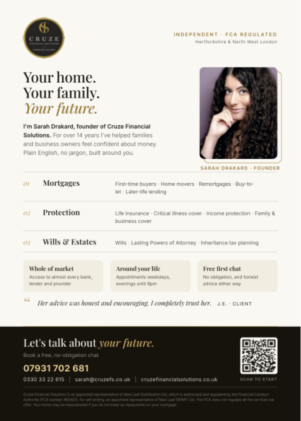
A5 magazine adApproved and print-ready: ivory, charcoal band, QR to the website, FCA and repossession lines in the small print.
Sarah Drakard
Business card · 85 × 55 mmCharcoal front with the badge, ivory back with her details. Uncoated card, so the ivory reads as paper.
sarah@cruzefs.co.uk
cruzefinancialsolutions.co.uk
Your mortgage recommendation
Letterhead · A4For recommendations, disclosure documents and anything that gets printed and posted. Small print on the footer of every page.
Her positive but very professional attitude put me at ease. Her advice was honest and very encouraging. I completely trust her.
Response from the ownerThank you so much. It was a pleasure helping you, and I'm always here if anything changes. Sarah
Review repliesIncluded in her package. Every Google review gets a polite reply in her name, and happy clients get a gentle nudge towards Google at the right moment.
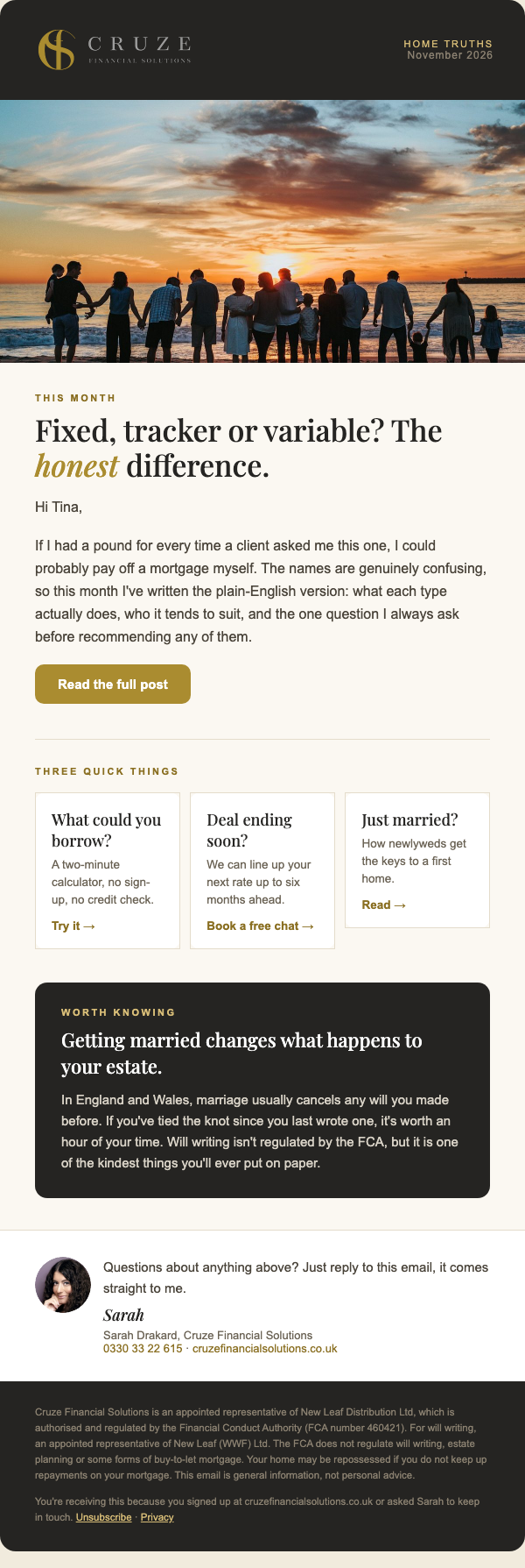
Email newsletter · "Home Truths"A monthly email she can send from Sender or Kit: one plain-English article, three quick links, one thing worth knowing, and the regulatory lines in the footer. Built as a template, so each month she only changes the words.
Money, explained properly.
One email a month from Sarah: plain-English answers on mortgages, protection and wills. No sales pitch, unsubscribe any time.
Newsletter sign-upThe pop-up on the blog and the box at the end of every post. It feeds her Sender or Kit list directly, with the consent line GDPR needs.
Sarah Drakard DipFA DipMAP CeMAP CeRER MLIBF
Email signatureHer current signature, tidied: monogram, qualifications, numbers and a booking button, with the regulatory line and the data notice she already uses kept underneath.
Posts, stories and profiles
Three post templates she can keep reusing: a Meet Sarah post with her photo, a plain-English tip on charcoal, and a big-number post. Every mortgage post carries the repossession line in small type, so nothing has to be pulled later.
Advice you'd trust with your family.
Mortgages, protection and wills, explained in plain English by Sarah Drakard.
Meet Sarah · 1080 × 1350Her photo does the work. The gold italic word is the only decoration.
Fixed, tracker or variable? The honest difference.
Tip post · 1080 × 1350No photo needed. The repossession line sits at the bottom of every mortgage post.
What your first chat costs.
No fee, no obligation, no jargon. Just honest answers about your mortgage, your cover and your will.
Big number · 1080 × 1350One true number stops the scroll. Only facts she can stand behind go here, never borrowed statistics.
Hertfordshire & North West London · Est. 2019
Free first chat: 0330 33 22 615
Your family.
Your future.
Instagram profileHer existing handle. Charcoal, ivory and photo posts alternate so the grid looks planned. Highlights split the work by service.
Just married? Let's get you home.
Two incomes, one deposit, a lot of questions. A free first chat answers most of them.
Story · 1080 × 1920Instagram and Facebook stories with a link sticker on the gold button.
Cruze Financial Solutions
Google Business ProfileWhat shows when someone searches "mortgage adviser near me". Logo, her photo, services and a Call button in one place.
Mortgages, protection and wills, in plain English
Hertfordshire and North West London
Cruze Financial Solutions
Financial adviser · Hertfordshire
Facebook pageCover, profile picture and a Call now button, so anyone who finds her on Facebook can ring straight away.
Just married and wondering about your first home together? Two incomes can change what's within reach. Free first chat: 0330 33 22 615
In the Facebook feedHow a post looks when it turns up for people nearby.
Mortgages, protection and estate planning, without the jargon
Sarah Drakard · DipFA CeMAP CeRER · Hertfordshire and North West London
LinkedIn banner · 1584 × 396Where her professional referrals come from. Her qualifications sit under the headline, as on her email signature.